GNC Master Brand Development
Founded in 1935, GNC, America’s first nutritional wellness company, never actually had an master brand- Just a logo.
Scroll ↓
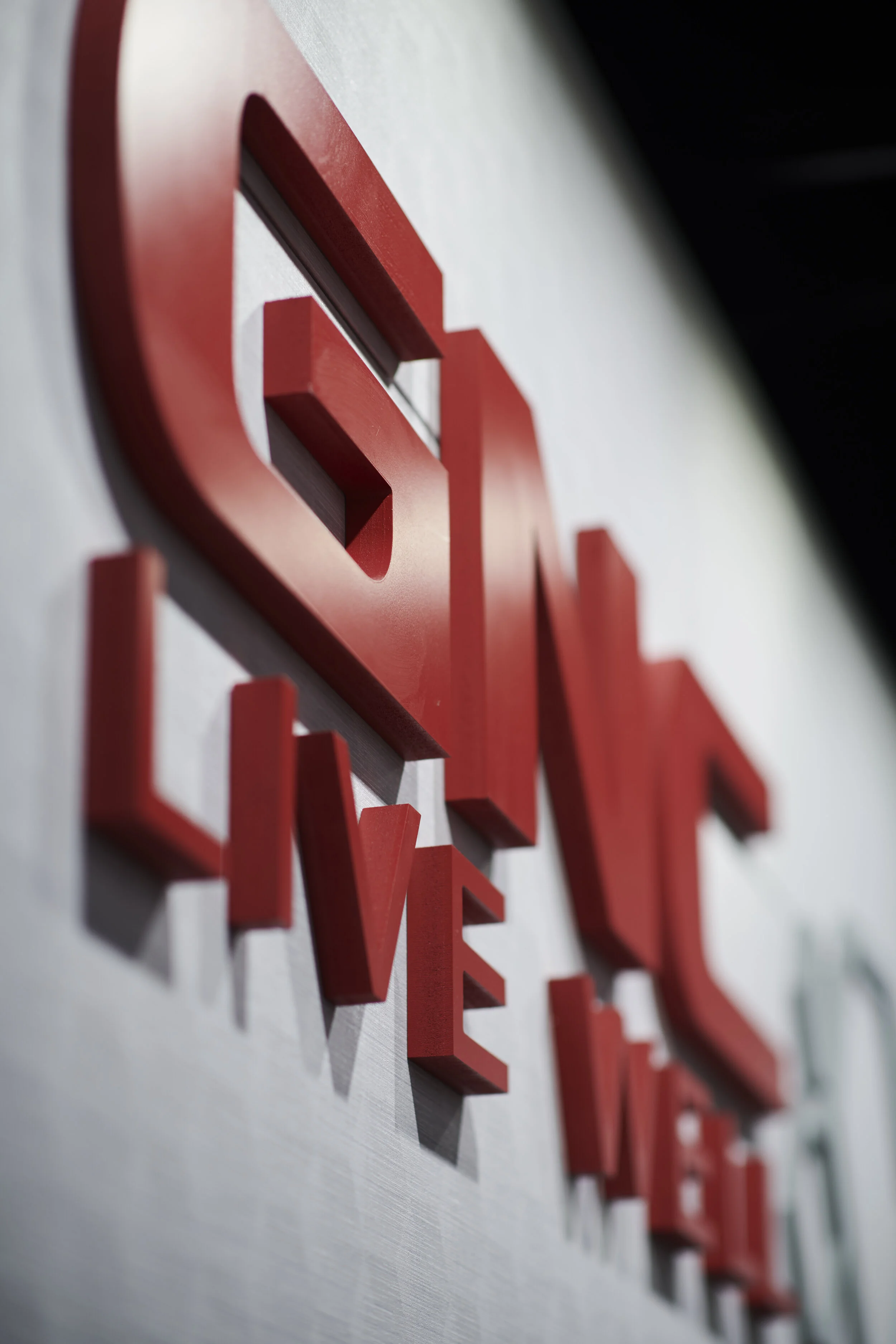
New branding at GNC World HQ
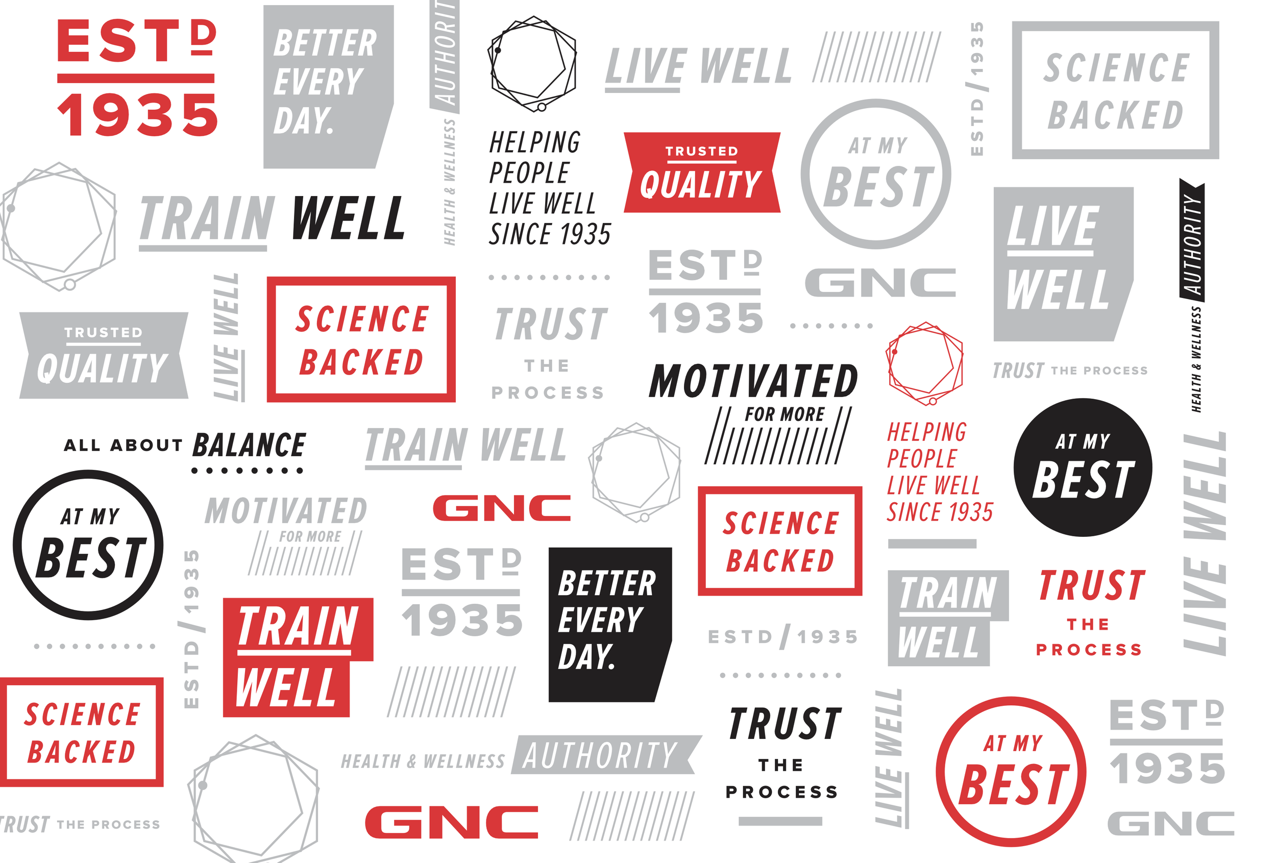
GNC’s brand wasn’t just in need of a refresh, it needed a complete corporate master brand design from the ground up. Leveraging three core assets, distinctive to the company (the knowledgable store associates, the color Red, and “Well-isms”) our internal creative team created a cohesive and recognizable Brand that feels modern and energetic. Two words not previously associated with this legacy brand.
The color red and new, dynamic typography created powerful graphics
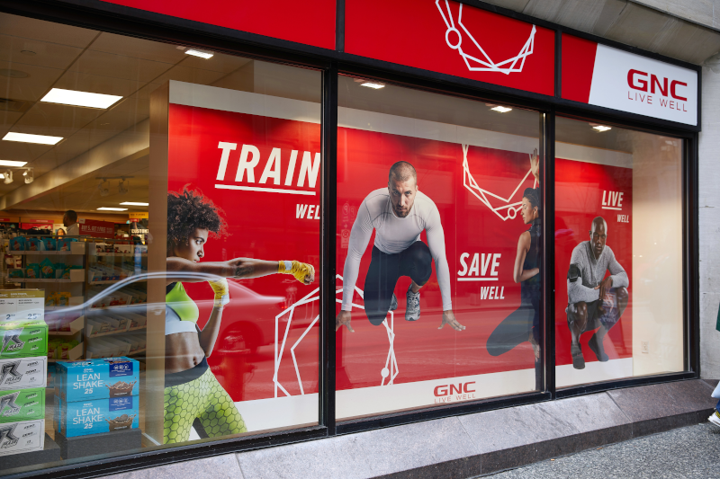
Bold new store graphics boast serious stand out power, especially in the wellness space
The majority of GNC retail stores were previously dark, drab -and stuck in the eighties. This facelift initiative for flagship stores breathed new life into the shopping experience, and increased sales reflected equal excitement in these locations.


